Move by clicking arrows or swiping the touchscreen!
Violin virtuoso and teacher Marie-Helen Aavakivi had lovely photos that became the backbone of her site’s design; I was also inspired by the deep hues of violin lacquer.
Artist Rait Prääts had a clear vision of his new website. I added a few quirky details.
How to visually express flamenco? Classic red seemed the most appropriate.
A small design startup’s site got a minimal look, with an emphasis on line art. The logo and icons were designed by the client.
Glass artist Kai Kiudsoo-Värv’s site took a long time to polish, while exchanging ideas with the owner.
The challenge here was transferring an old site onto the WordPress platform, as well as restoring the site’s sizable archive.

A one-pager that scrolls like a roll of film stock, this video studio’s page is no longer online.
Artists Sofi Aršas and Jaana Kormašov, and their shared studio. I rarely use animation, but it seemed fitting here, especially since Sofi is also a dancer.
A school is a beehive of activities, all of which need to find room on their website. I also re-drew the school’s logo.
This school is housed in a Brutalist piece of 80s architecture. The site, like the school building itself, is changing and evolving.
A portal connecting all of a municipality’s sports events and facilities. The design process convinced me that the local audience loves sites without white background. Easier on the eyes, perhaps?
Promoting current news and preserving past happenings at this home of creativity and art.
Erki’s sound art projects required a separate site, one echoing the DADA spirit evident in Erki’s unusual instruments.
Kairi Orgusaar divides her time between painting and glass art; this simple site lets both of them shine.
A page uniting a number of youth centres under a shared information network.
The EGAU site has withstood the test of time, having required no major changes (except security updates) since 2014.

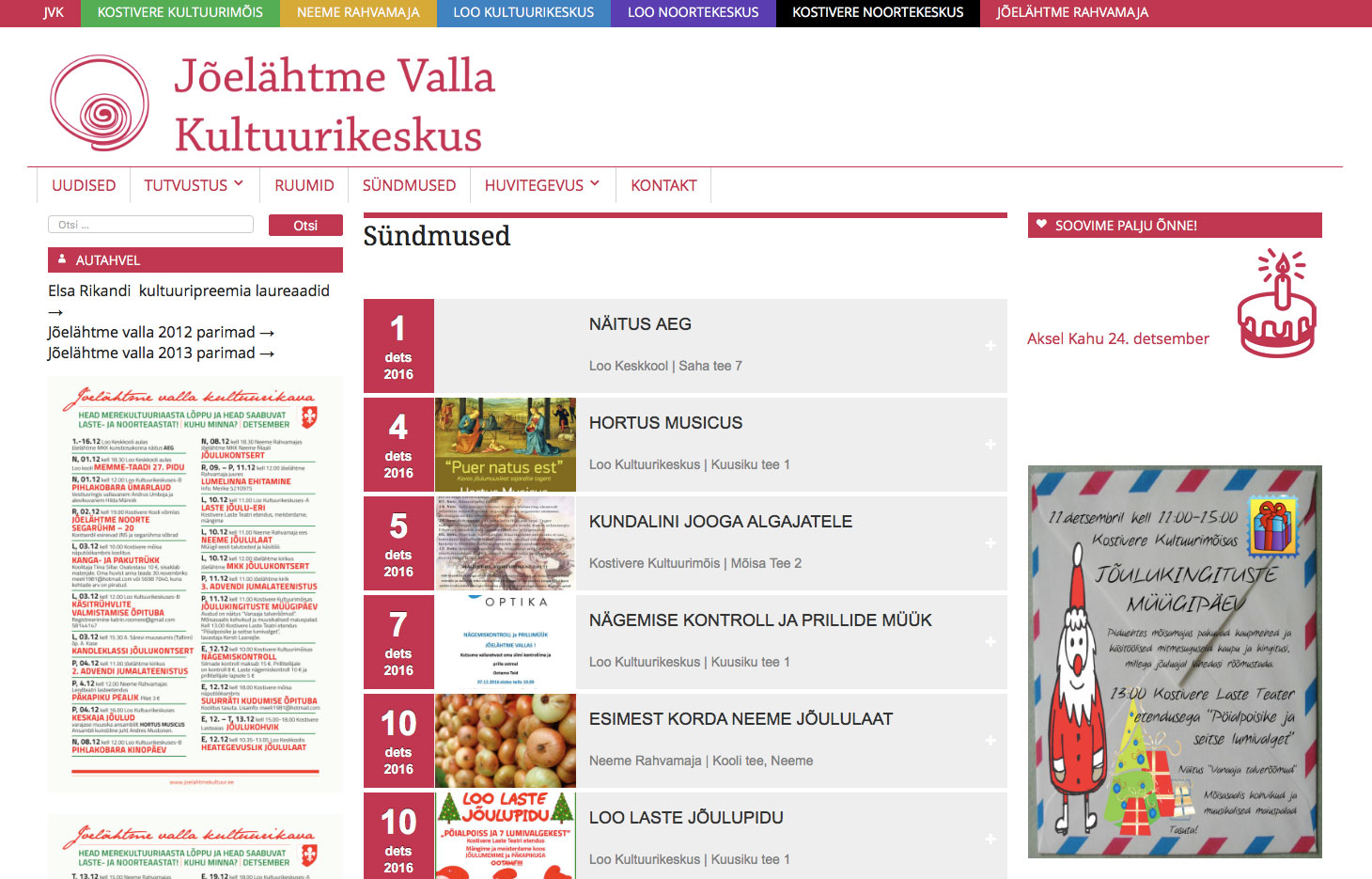
My first Multisite – five different community centres were housed under one roof, while preserving the individuality of each – from the Baroque to the Modernist.

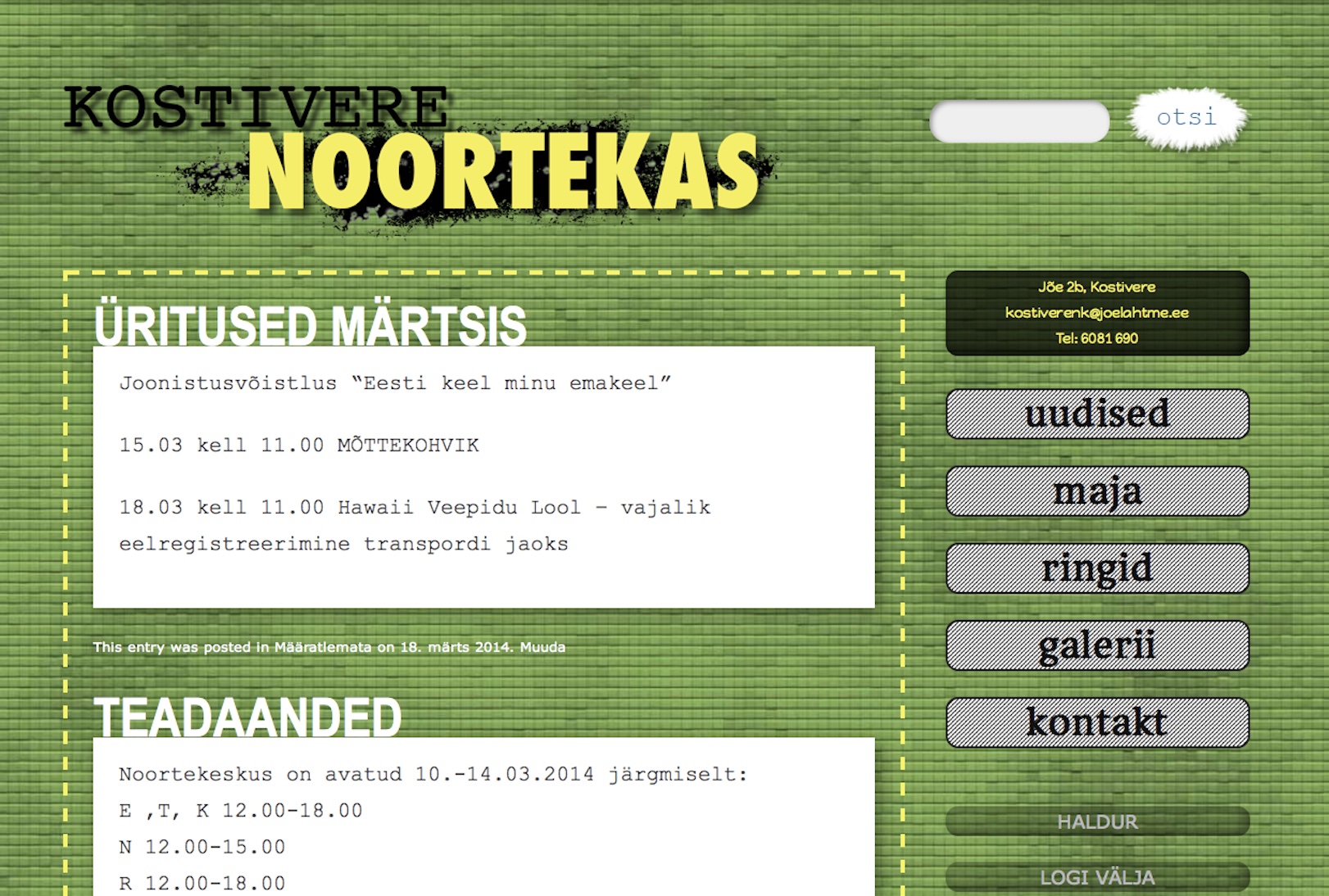
Before transitioning to a unified design with other local youth centers, Kostivere had a page like this.
A portfolio for photographer Mati Hiis lets the photos speak for themselves.


